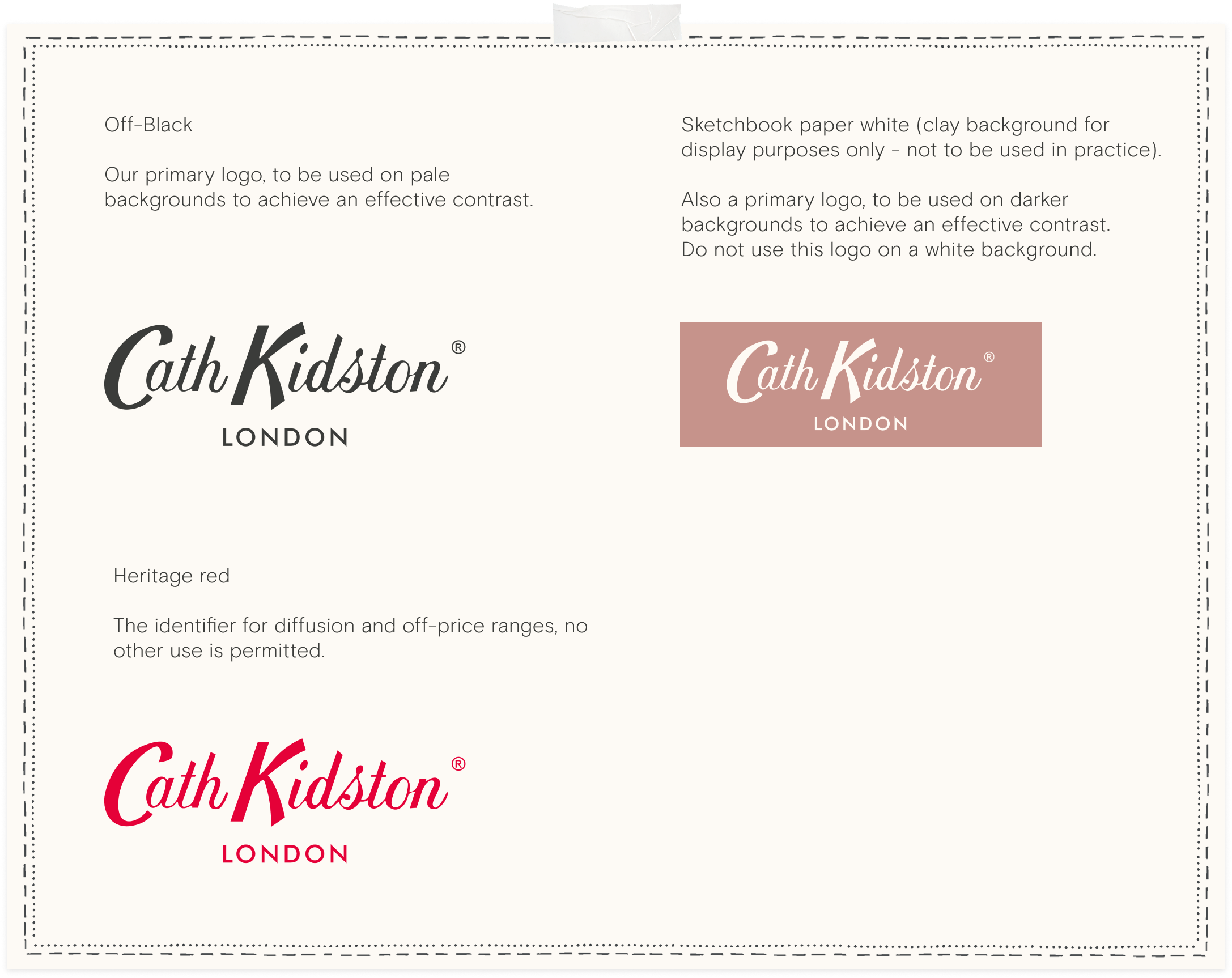
If the artwork is too busy then try without the ‘London’, but the trademark symbol is always required.
4.2
Logo
Padding
The logo should have a space at least equivalent to its height above and below it, and either side should have a minimum space equivalent to the width of the K.
Please adhere to the following rules around logo use.
4.3
Logo
Variants
4.4
Logo
Do's and don'ts
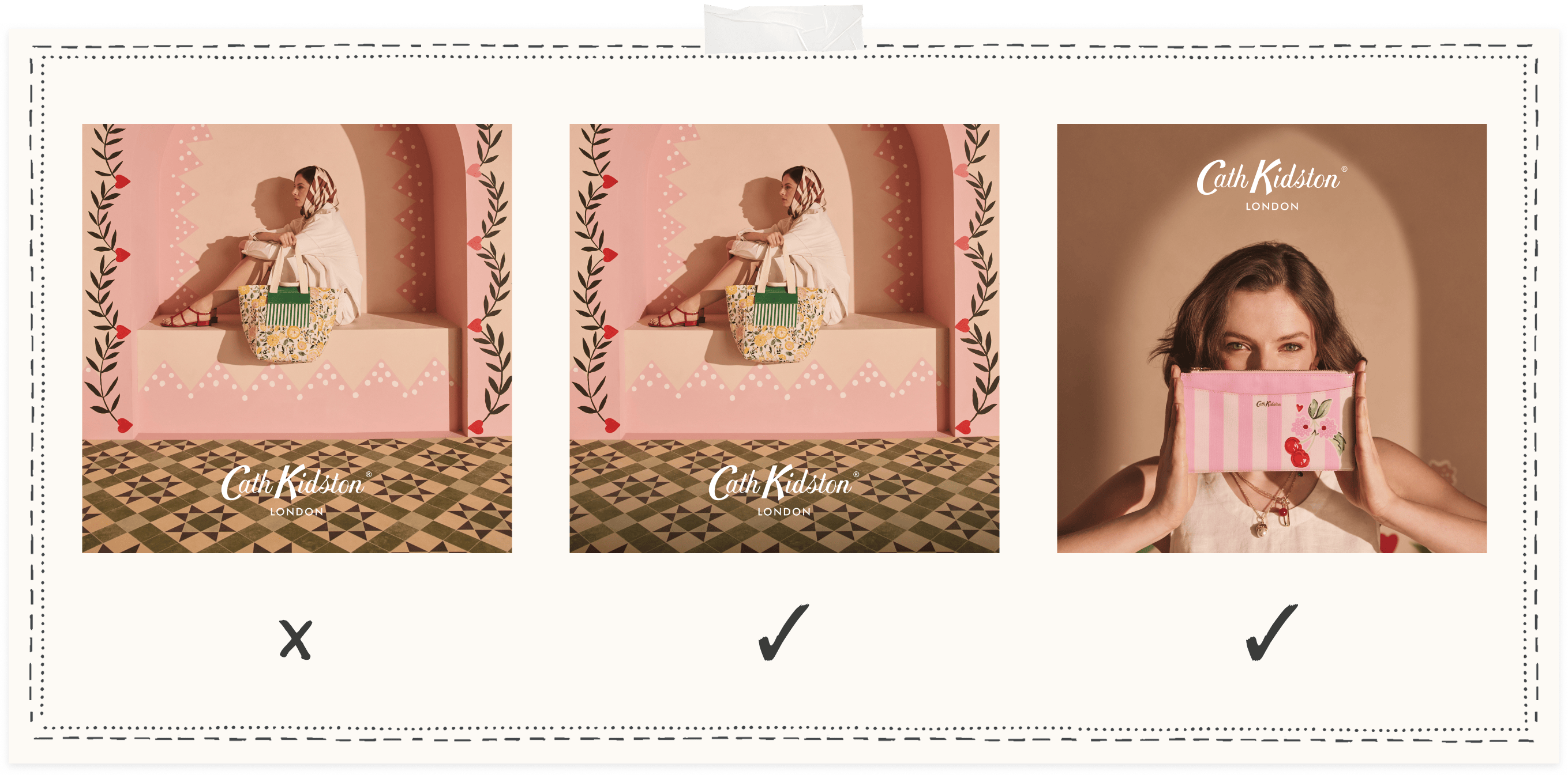
Things to avoid when using our logo.
Dark overlays can be used to ensure content is legible when used with imagery. Where sufficient space is available, no overlay is necessary, as in the last example.
4.5
Logo
Contrasting
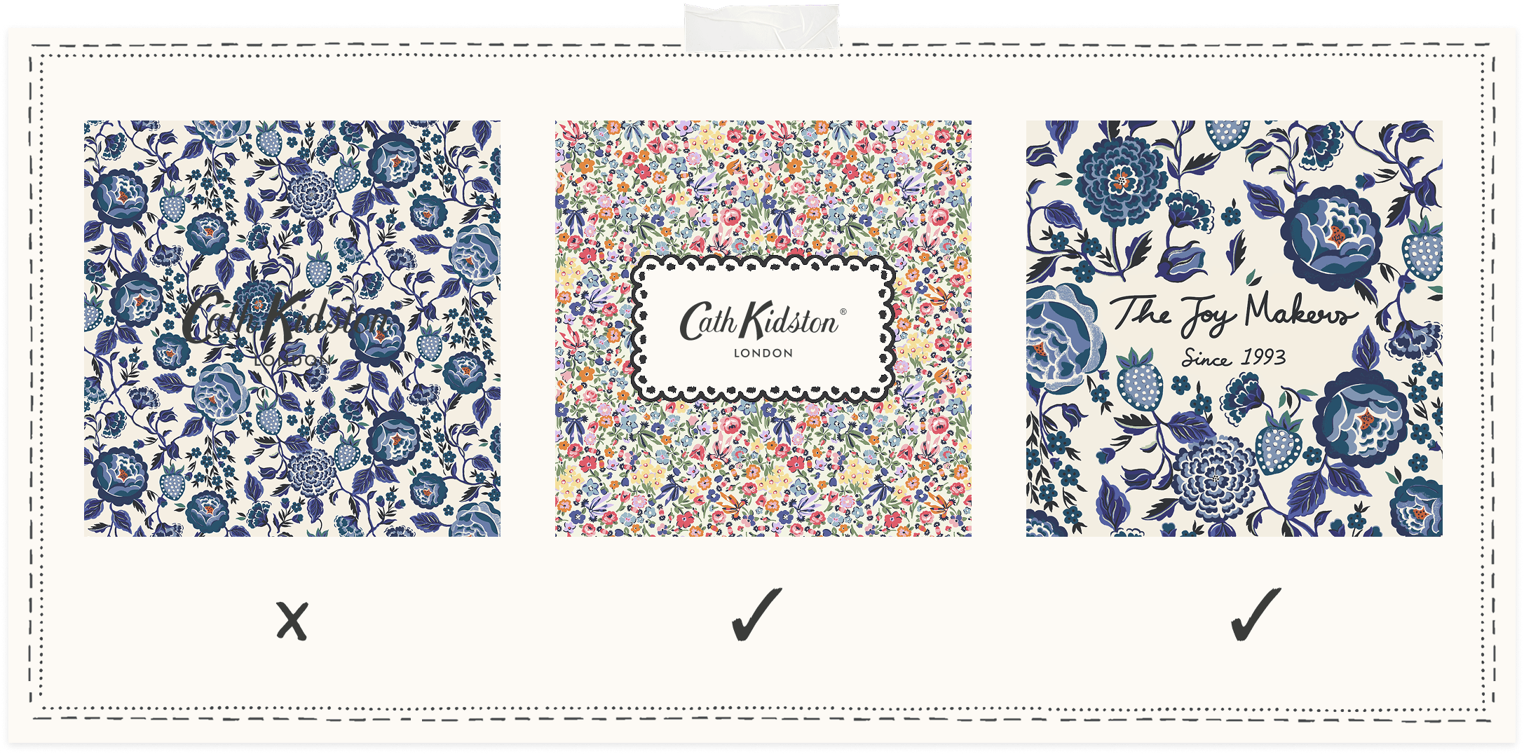
In digital formats, our Evergreen prints are used primarily as backgrounds for social content.
When on a ditsy print, a scalloped border should be used to isolate the logo so that it's clearly legible.
When against a floral with ground space, the elements should be cut away so that the logo/copy can be nestled amongst the natural flow of the print.
4.6
Logo
Print placements
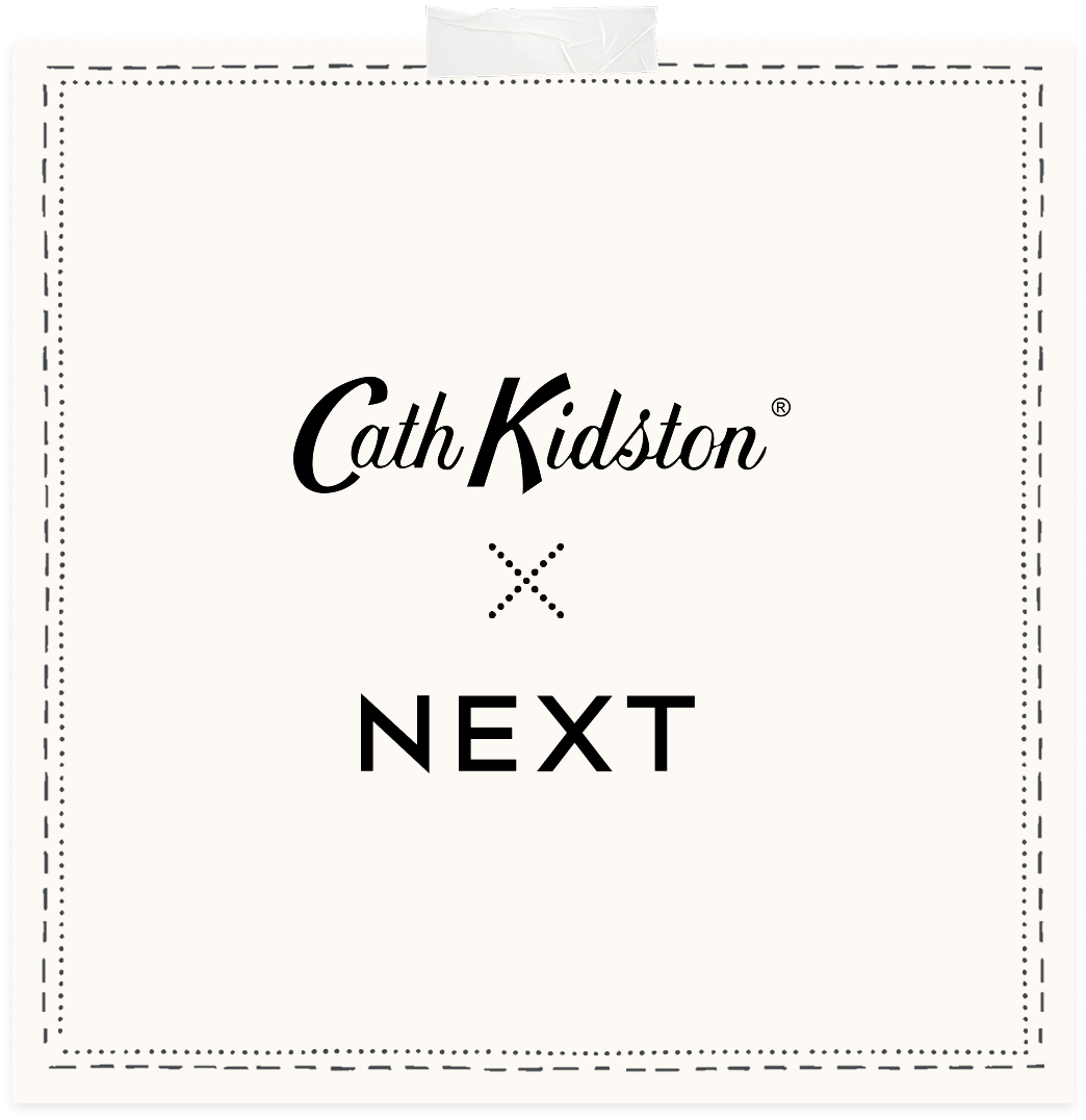
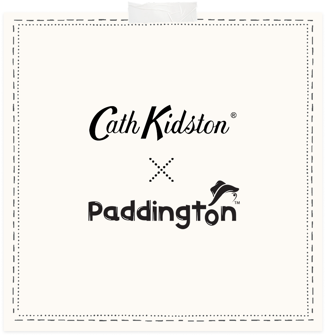
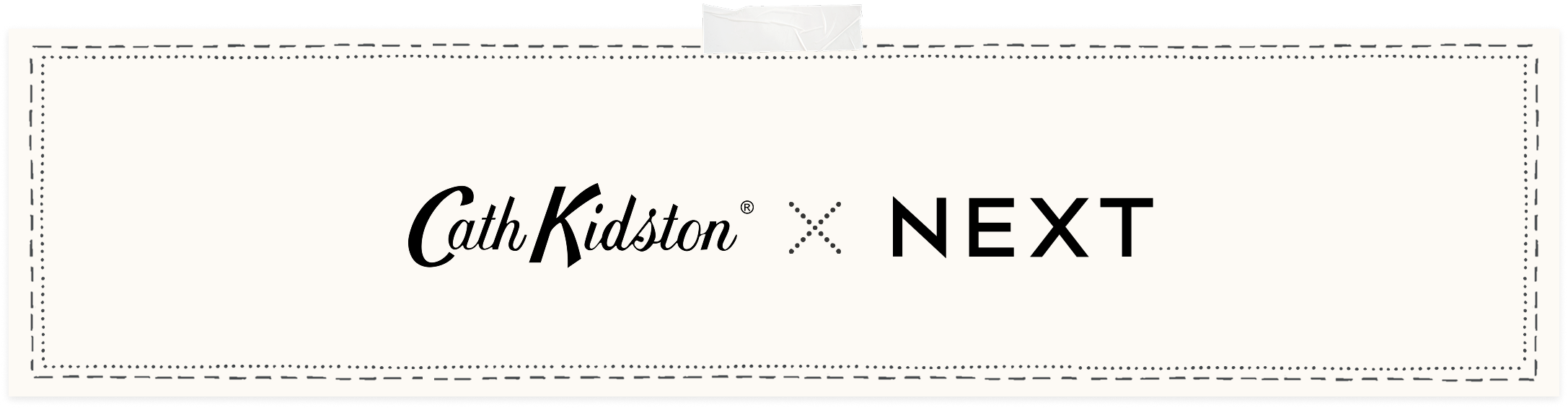
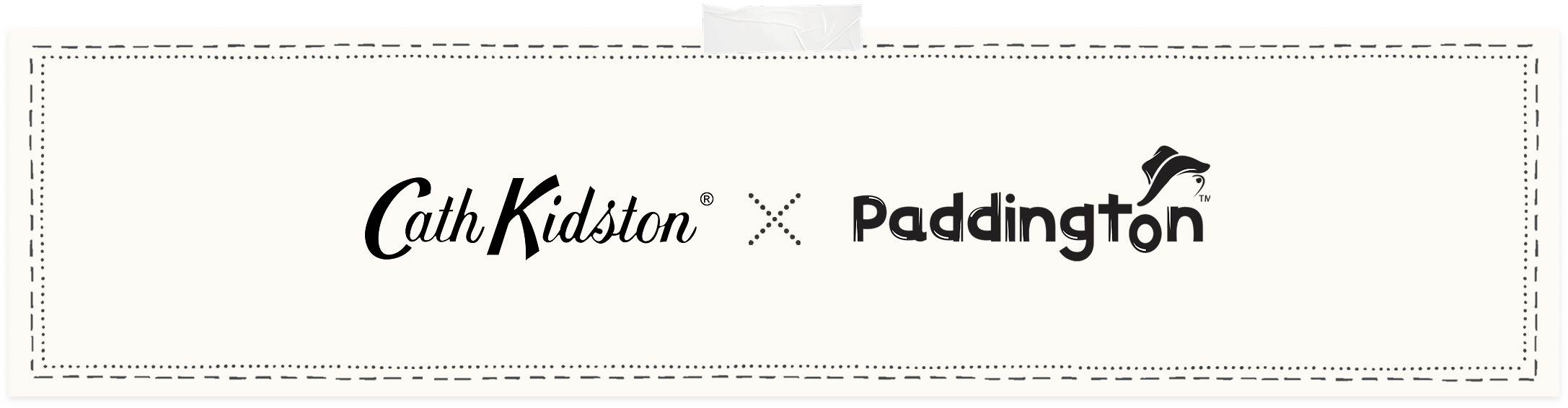
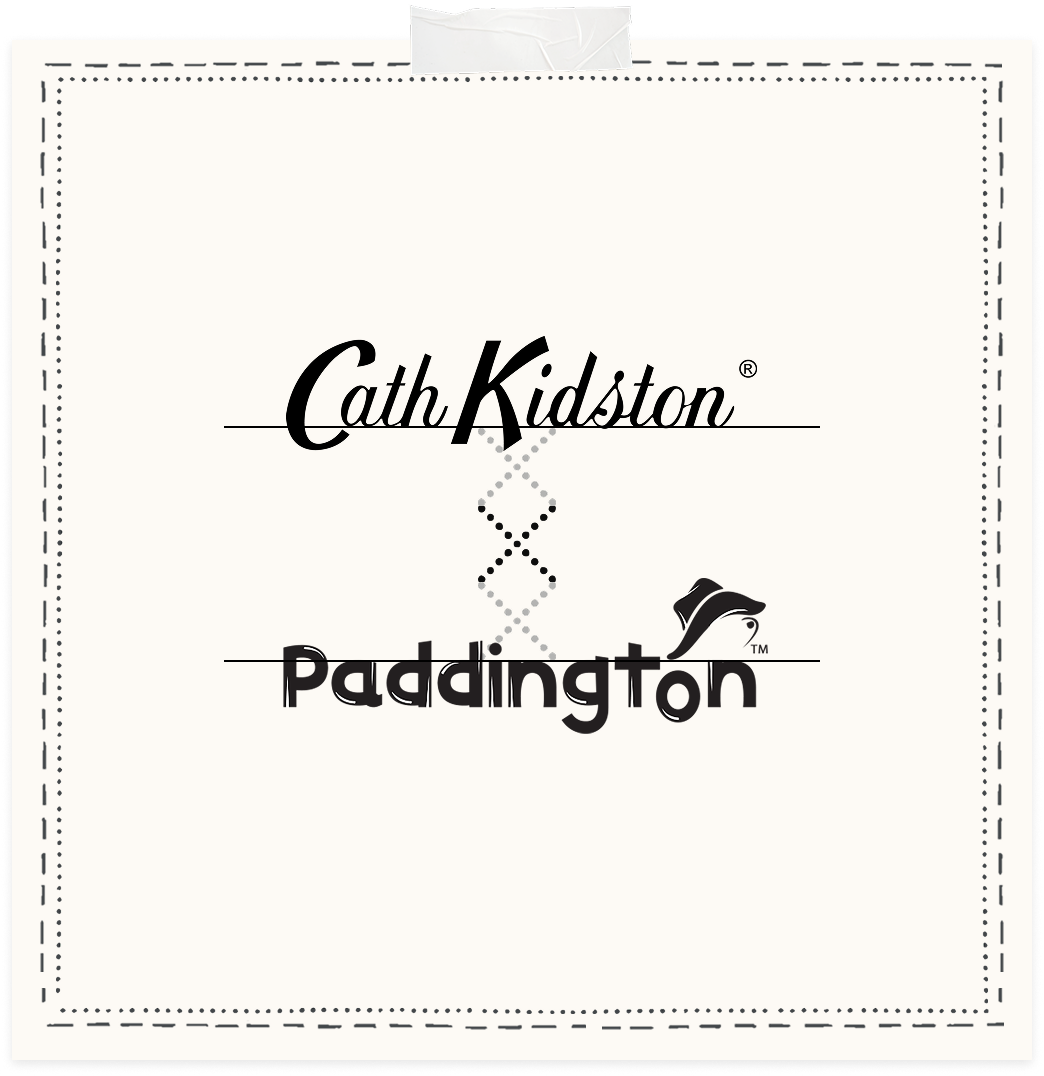
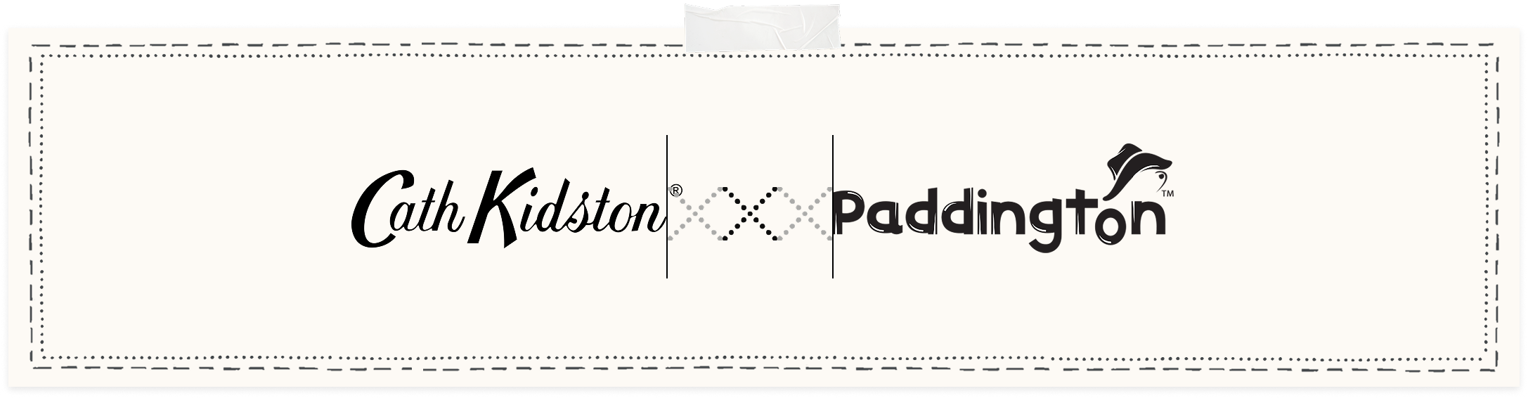
Collaborations use a custom dotted 'X' which can be found in our asset bank. 'London' is not needed for collaborations, but the trademark symbol is still required. Note: from April 2026 we will be moving to a handwritten 'X' in our Rumpi font.
4.7
Logo
Collaborations
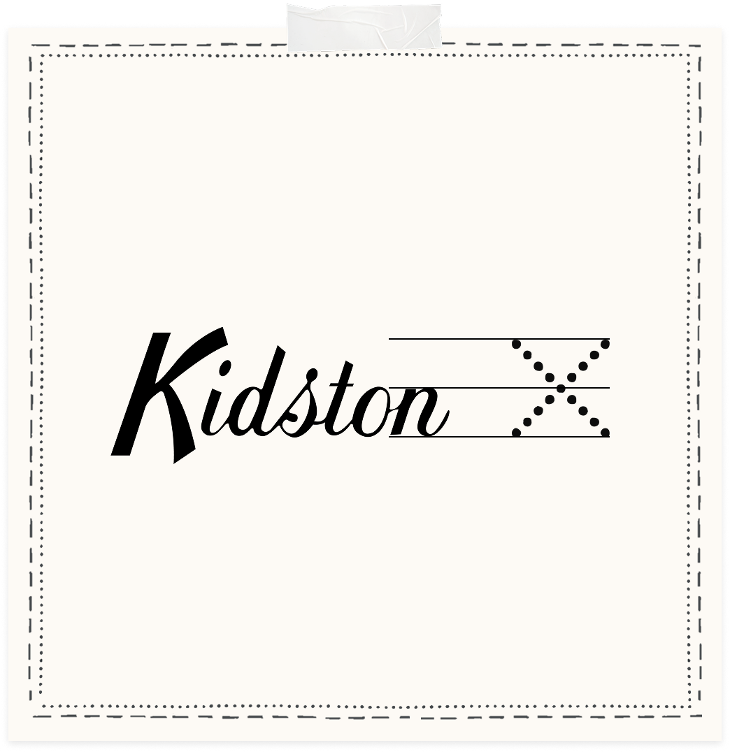
The height of the collab 'X' should be equal to 2x the height of the 'x height' which is displayed by the bottom two lines on the first design below.
On both vertical and horizontal collab designs, the distance between the logos should be equal to 3 'X'.
4.8
Logo
Collaboration padding
The 'X' should then be horizontally centred with both of the logos. If it looks wrong, then adjust optically until you are satisfied both logos are balanced.
Our ribbon logo is used on both product on graphics. It shouldn't be used on swing tags, labels or store signage. It comes in both a straight and arched variant.
4.9
Logo
Abbreviations & Icons
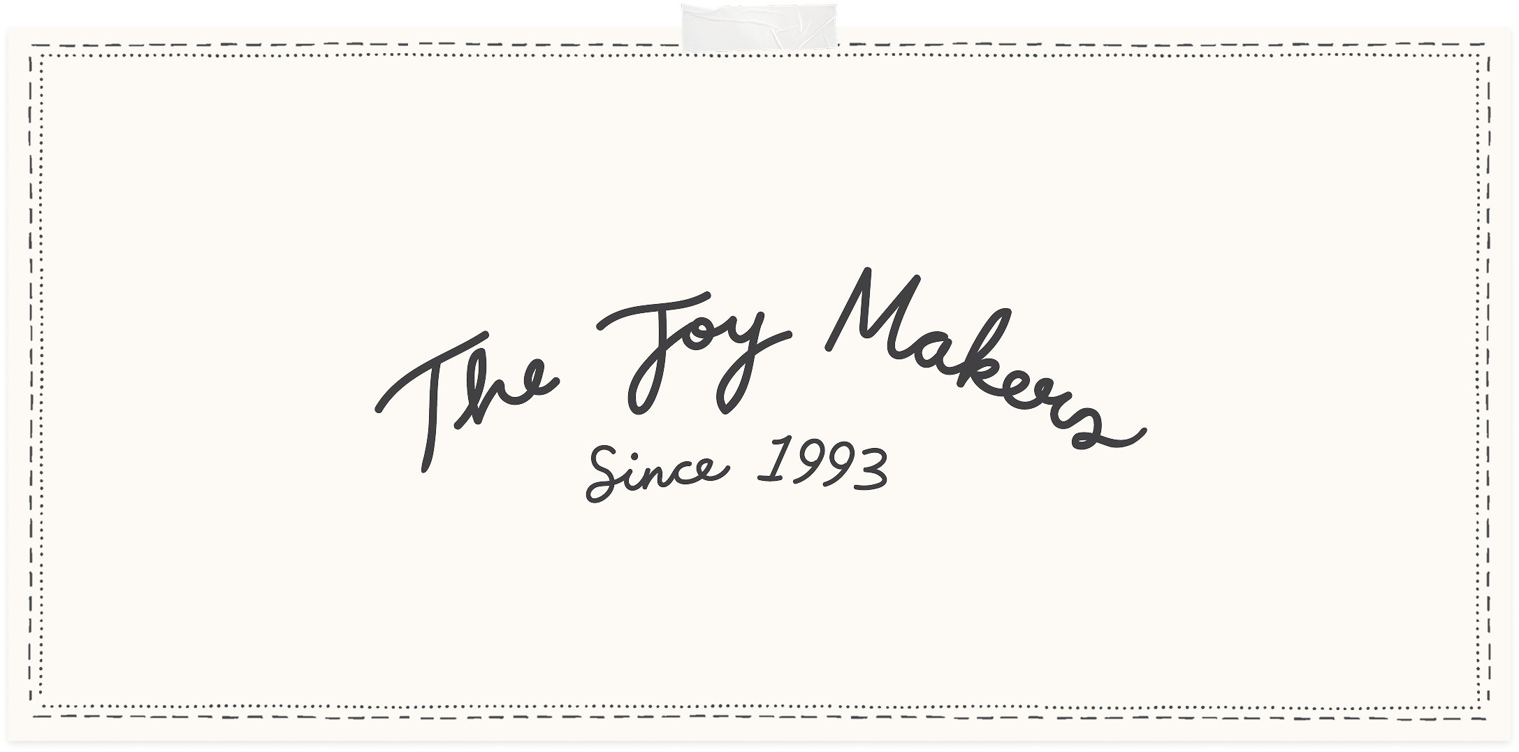
'The Joy Makers since 1993' is our brand motto/strapline which is used across and signage, signoffs and packaging. It's also available as both straight and arched variant.